Brochure
A Step in a
Healthy Direction
Apple
Pantone 7489 C
CMYK: 32, 0, 53, 33
RGB: 116, 170, 80
HEX: #74aa50
Tangerine
Pantone 1565 C
CMYK: 0, 37, 58, 0
RGB: 255, 160, 106
HEX: #ffa06a
Iron
Pantone 427 C
CMYK: 2, 0, 0, 17
RGB: 208, 211, 212
HEX: #d0d3d4
Project Statement
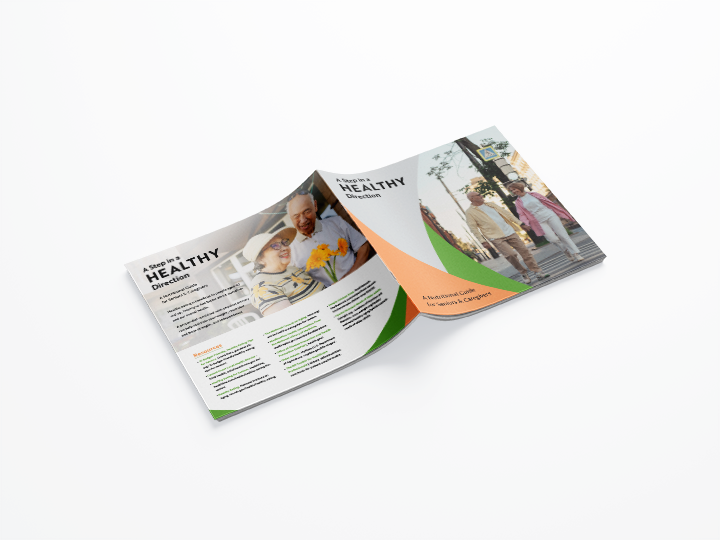
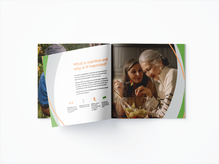
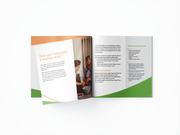
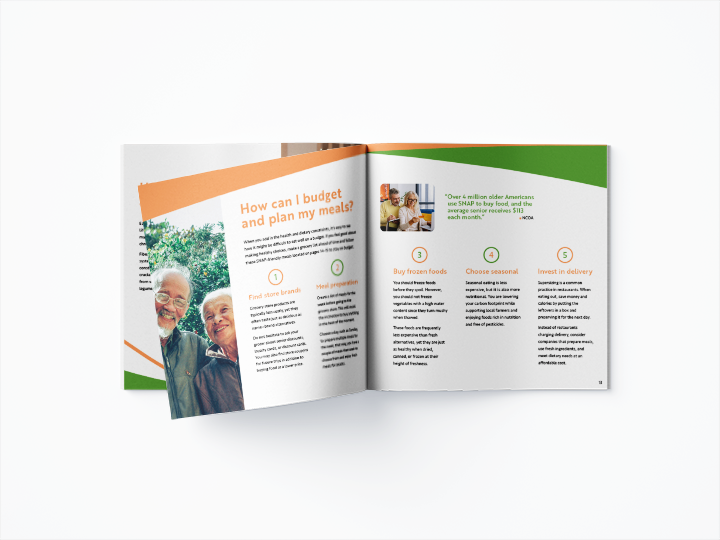
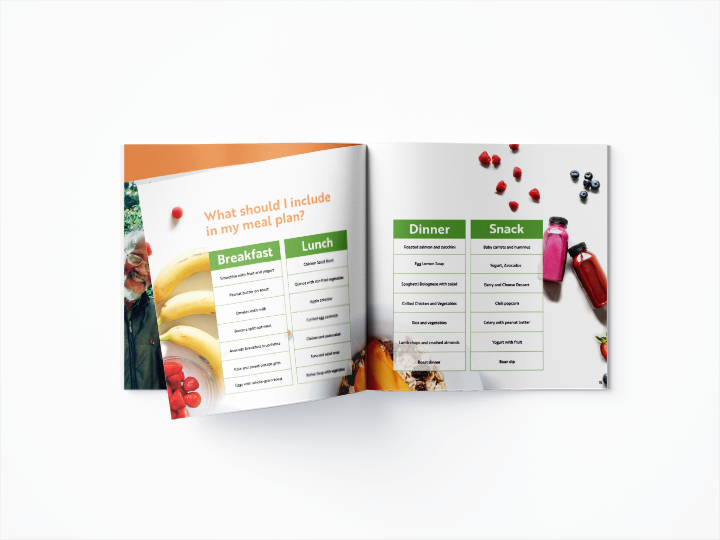
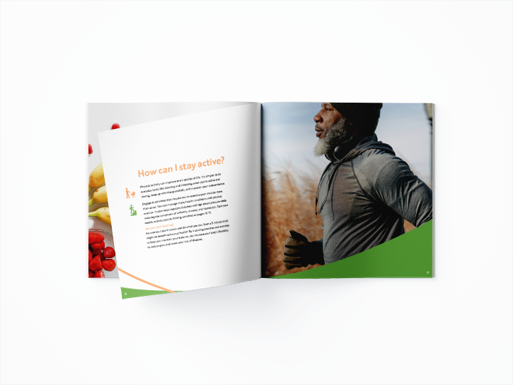
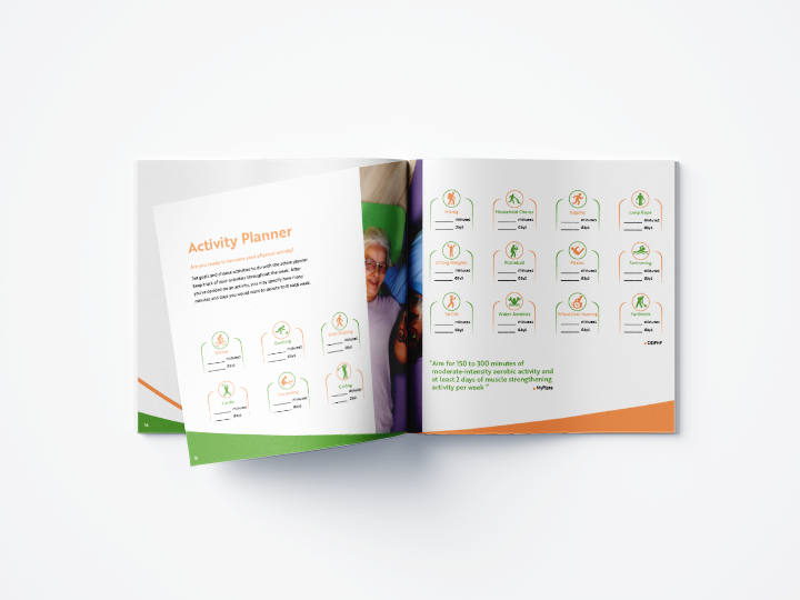
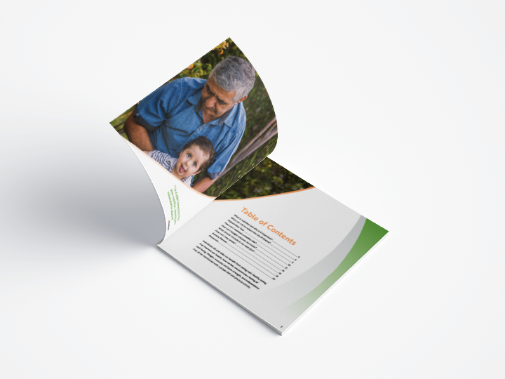
A Step in a Healthy Direction showcases the information and composition as a printed multi-page brochure, centering around a balanced diet and healthy lifestyle for older adults, offering energy, and supporting weight management while preventing conditions such as heart disease, type 2 diabetes, and certain types of cancer.
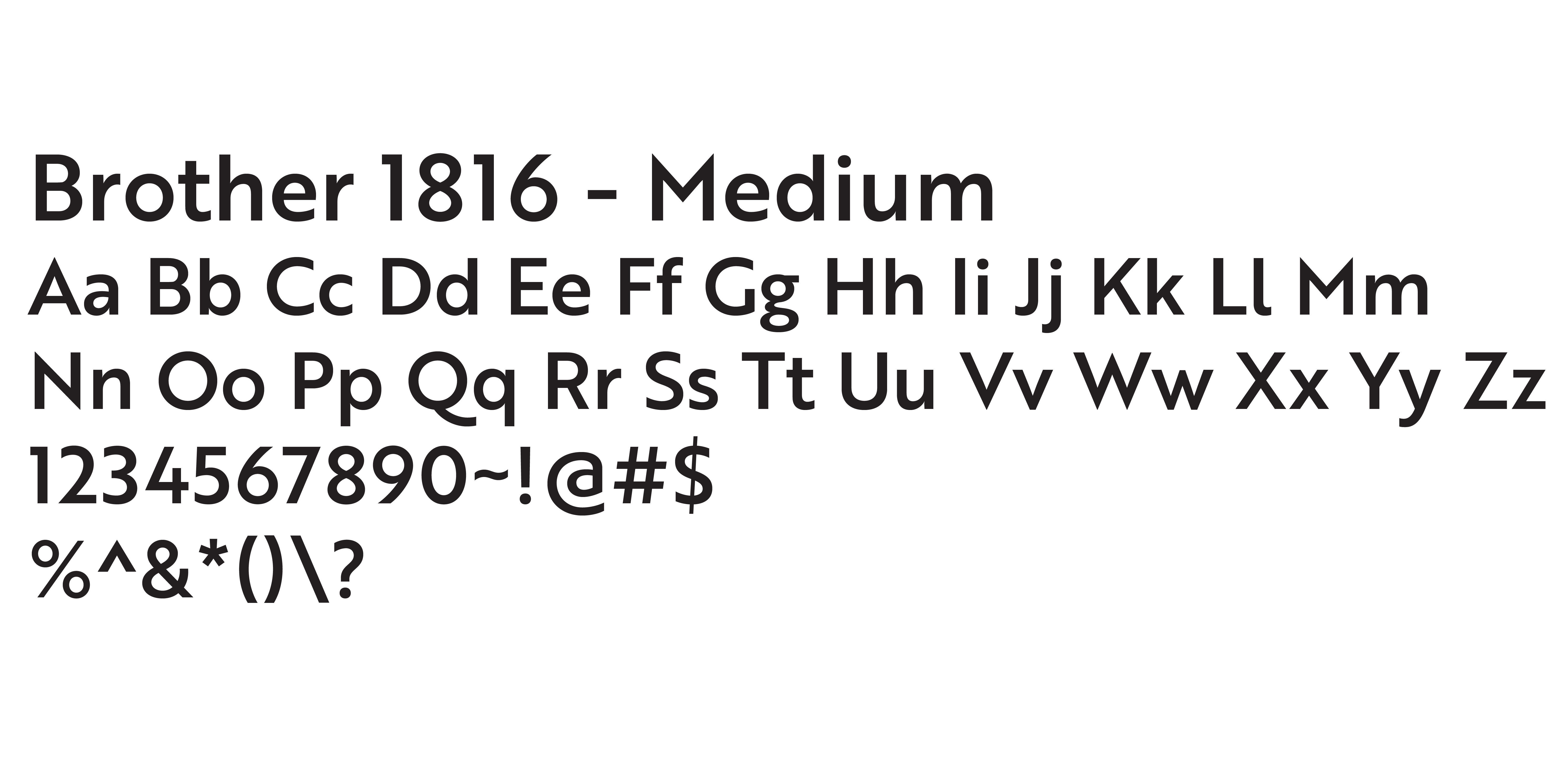
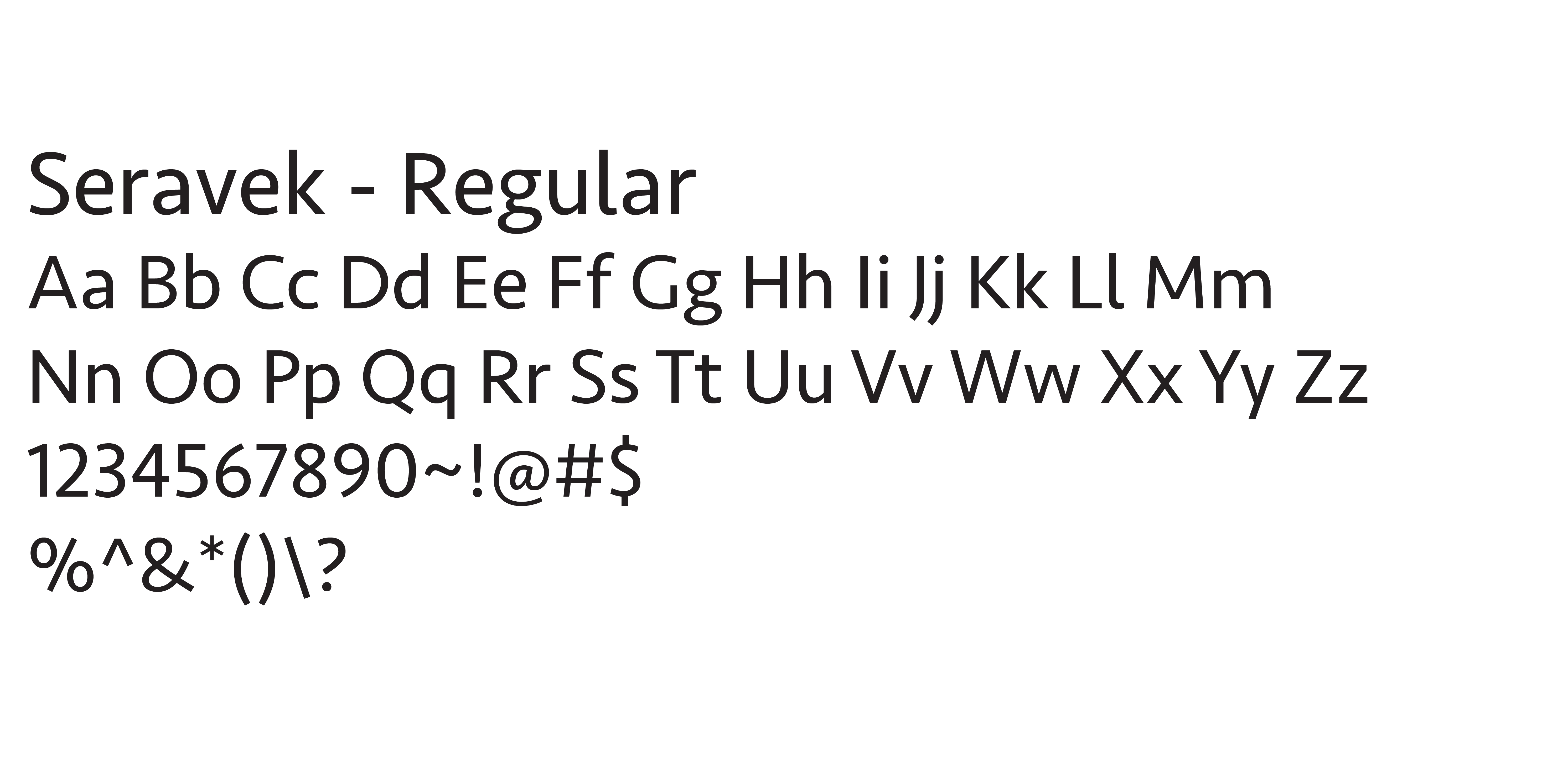
In this brochure, two sans serif fonts, Brother 1816 and Seravek, are designed to make the information accessible and encourage better eating habits among older individuals by offering nutritious meal plans, simple recipes, and valuable tips for staying hydrated.
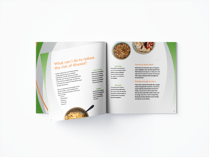
The research from sources such as MyPlate, Medline Plus, and the National Council on Aging are organized with headlines, subheads, body text, captions, and imagery, using style sheets, a baseline grid, and column grids to guide the typography, along with the color palette of green, orange, and gray. The creation of active icons and elements that align with the brochure’s theme is influential in taking the initiative of planning and promoting healthy living.
Development
Sketches
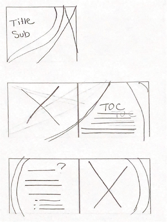
Front Cover, Table of Contents, and Intro Page
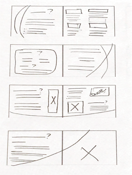
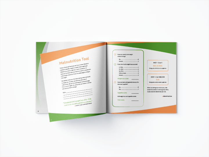
Malnutrition and Budgeting
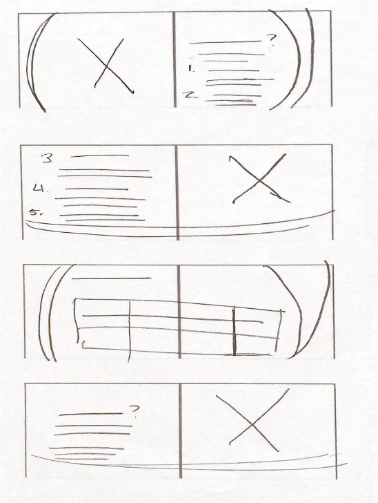
Finding a plan and chart for sample meal plans
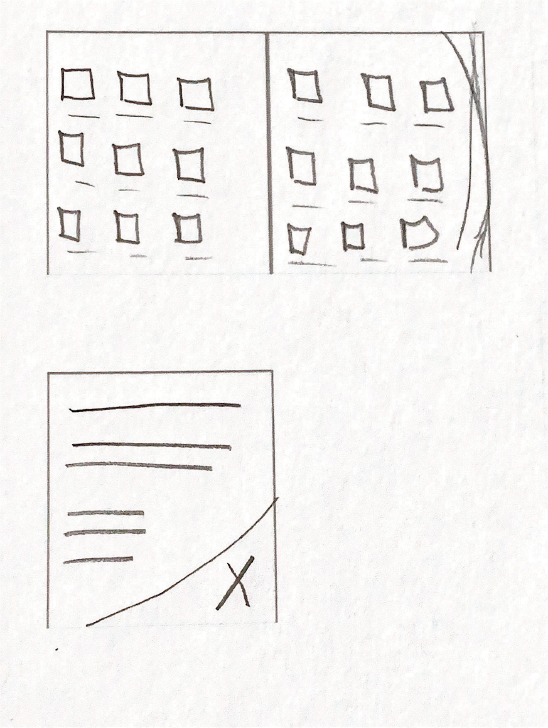
Activity Planner and Back Cover
Active Planner Icons
First Version
Second Version
Third Version

Final Version
Early Layouts
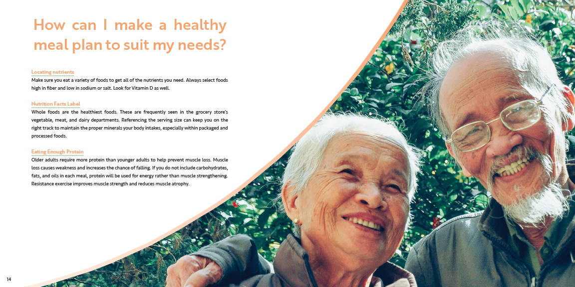
First Version of Healthy Meal Planning

First Version of Budgeting Options
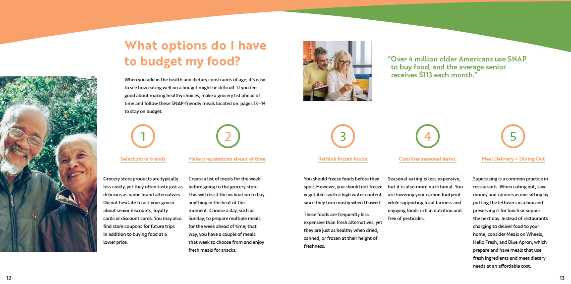
Condensing the content of Healthy Meal Planning and Budgeting Options into one spread
Brochure
A Step in a Healthy Direction Brochure

