Overview
— Project Statement
A Step in a
Healthy Direction
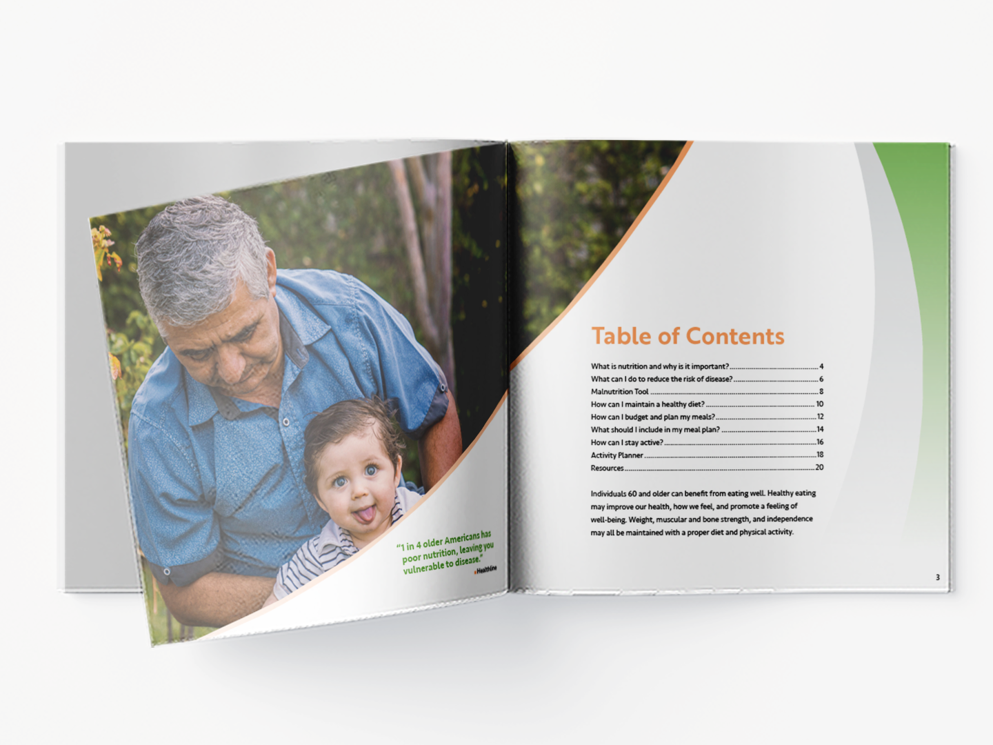
A Step in a Healthy Direction showcases the information and composition as a printed multi-page brochure, centering around a balanced diet and healthy lifestyle for older adults, offering energy, and supporting weight management while preventing conditions such as heart disease, type 2 diabetes, and certain types of cancer.
In this brochure, two sans serif fonts, Brother 1816 and Seravek, are designed to make the information accessible and encourage better eating habits among older individuals by offering nutritious meal plans, simple recipes, and valuable tips for staying hydrated.
The research from sources such as MyPlate, Medline Plus, and the National Council on Aging are organized with headlines, subheads, body text, captions, and imagery, using style sheets, a baseline grid, and column grids to guide the typography, along with the color palette of green, orange, and gray. The creation of active icons and elements that align with the brochure’s theme is influential in taking the initiative of planning and promoting healthy living.


— Color & Type Studies

Process
— Sketches

— Early Spread Layouts
— Brochure


