Overview
— Project Statement
Little o’ Me
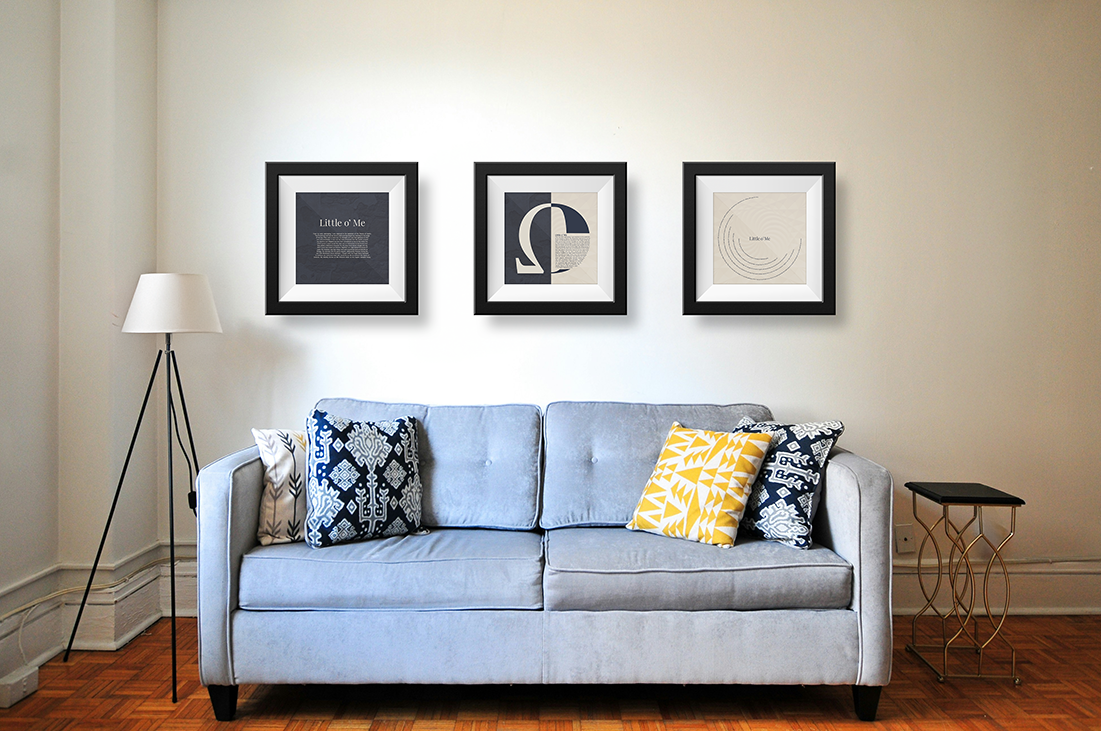
This project explores the letter “O’s” history, design, and origin. Three distinct layouts, each representing different aspects of the letter “O,” include symbol (letter), display type (headline), and text type (body). Each layout reveals the evolution from the Temple of Apollo to its place within the modern English alphabet.
The typography, Lust Sans, complements the Omega symbol, Bernina Sans Semibold highlights moments in the letter’s history from shaping as a pedestal to encircling as a text representing how the letter appears in today’s alphabet, and Playfair Display Regular introduces contrast in titles. The copy is thoughtfully woven into the designs and serves as a cohesive layout, enriching the origin of the letter’s journey.
The colors, derived from the Temple of Apollo and Greek mythology, infuse profound meaning. Blue signifies the sky and seas, and white represents purity. Both colors find their place in designs, paying attention to the origins of the letter “O.”


— Color & Type Studies

Process
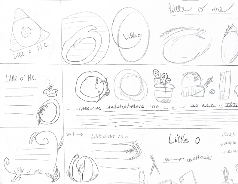
— Sketches
— Early Versions

— Poster Series


