Overview
— Project Statement
Ocean Shore
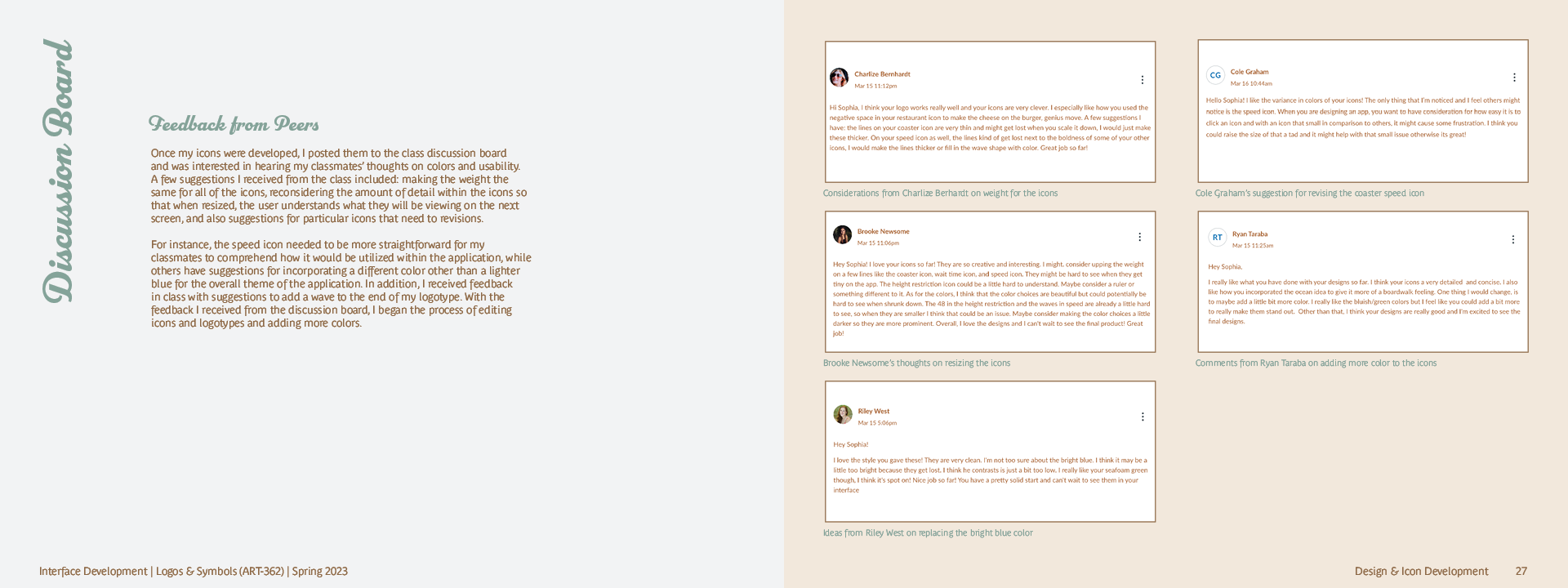
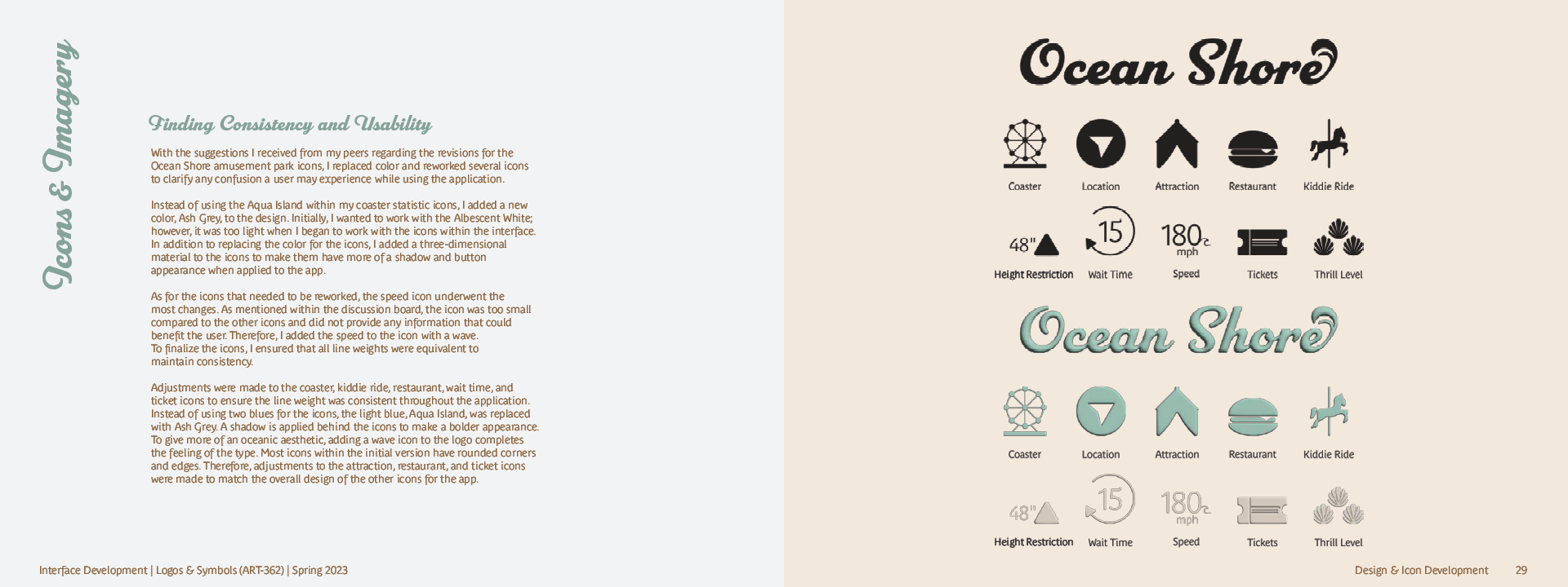
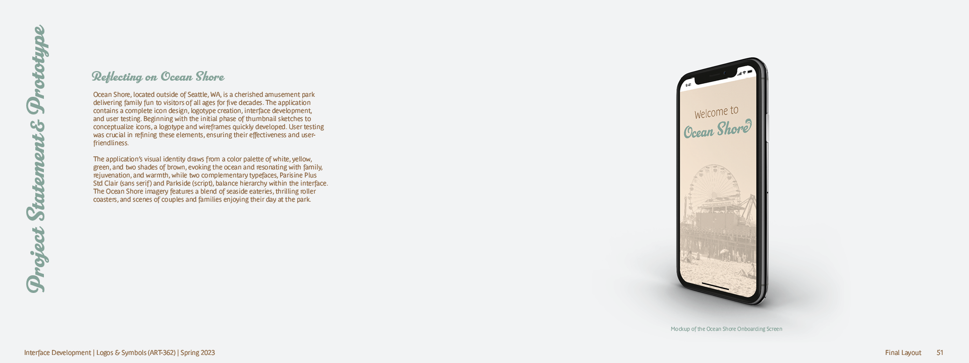
Ocean Shore, located outside of Seattle, WA, is a cherished amusement park delivering family fun to visitors of all ages for five decades. The application contains a complete icon design, logotype creation, interface development, and user testing. Beginning with the initial phase of thumbnail sketches to conceptualize icons, a logotype and wireframes quickly developed. User testing was crucial in refining these elements, ensuring their effectiveness and user-friendliness.
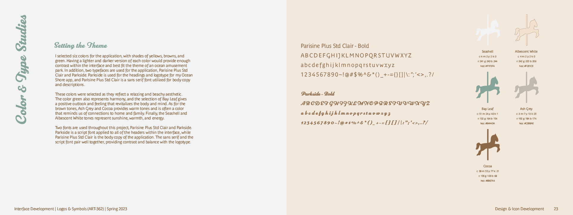
The application’s visual identity draws from a color palette of white, yellow, green, and two shades of brown, evoking the ocean and resonating with family, rejuvenation, and warmth, while two complementary typefaces, Parisine Plus Std Clair (sans serif) and Parkside (script), balance hierarchy within the interface.
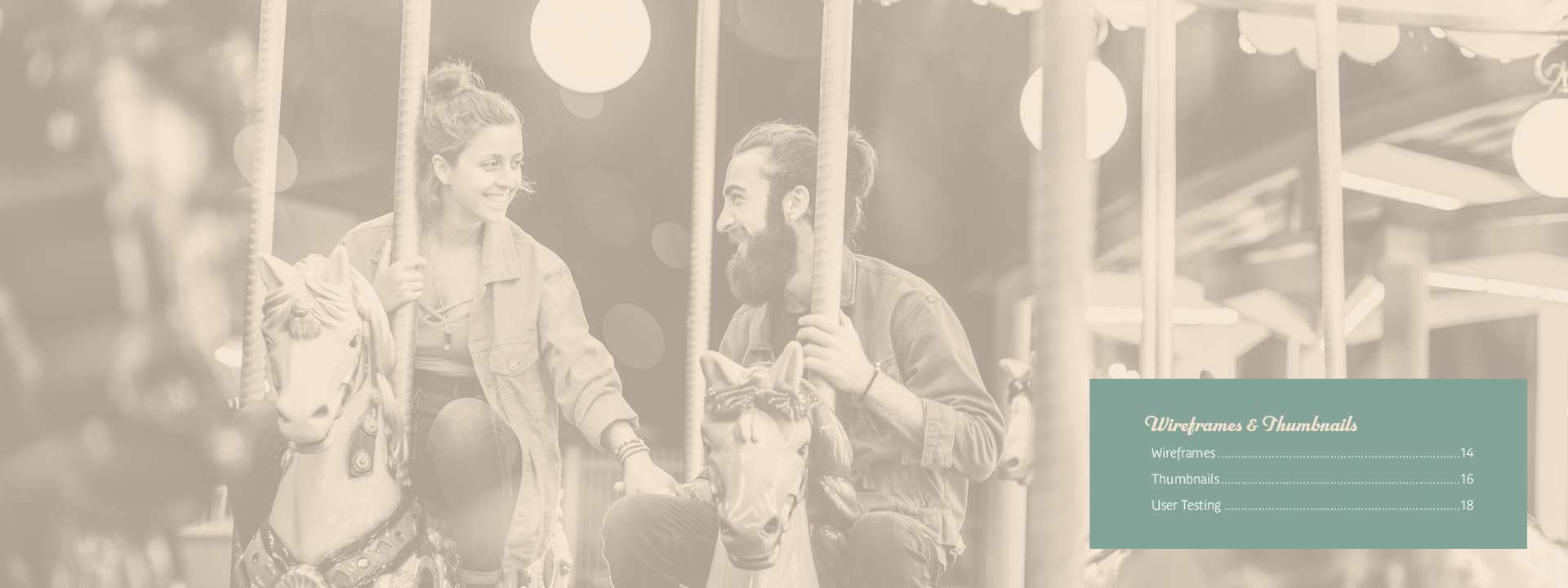
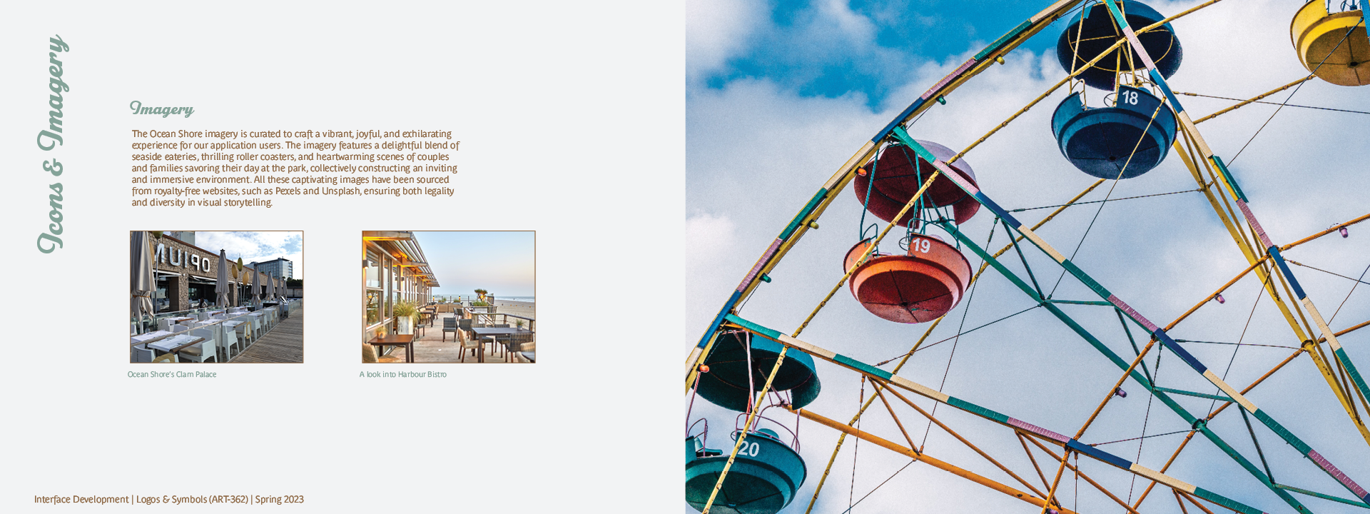
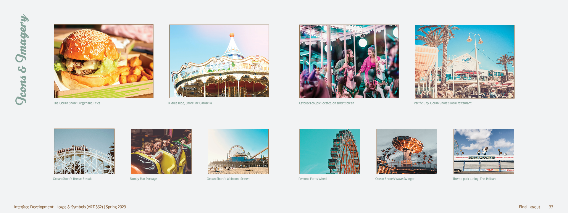
The Ocean Shore imagery features a blend of seaside eateries, thrilling roller coasters, and scenes of couples and families enjoying their day at the park.
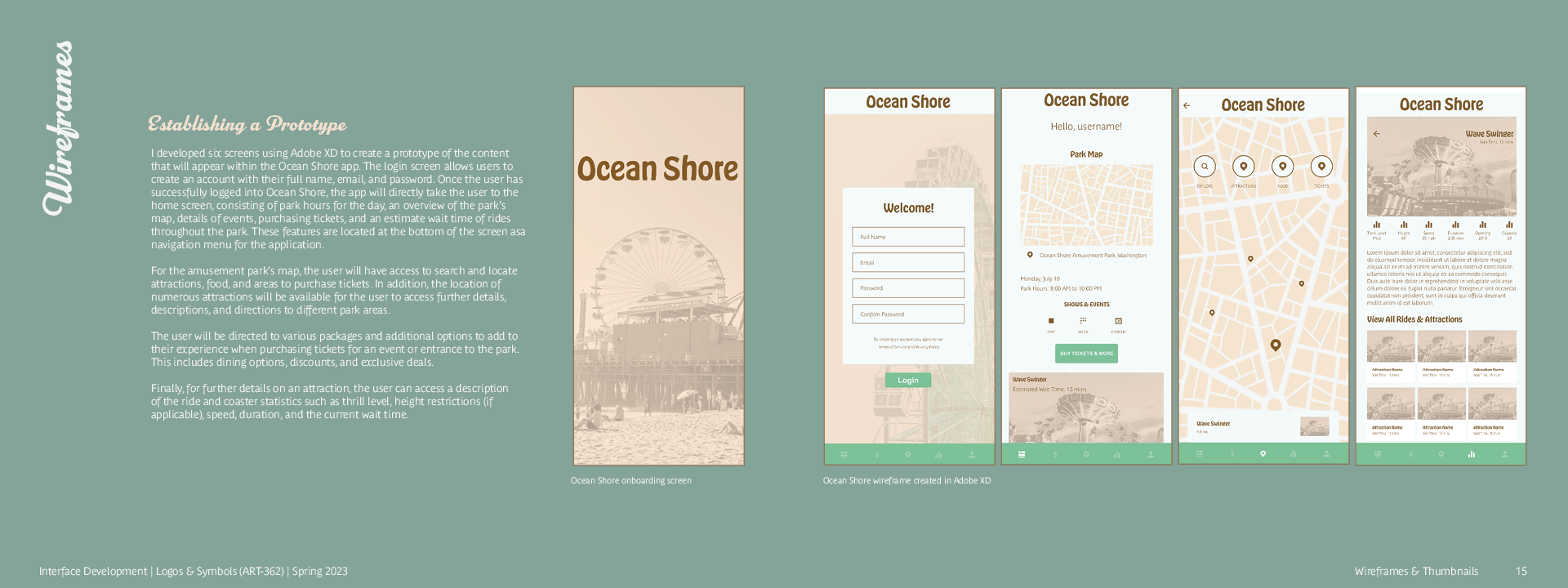
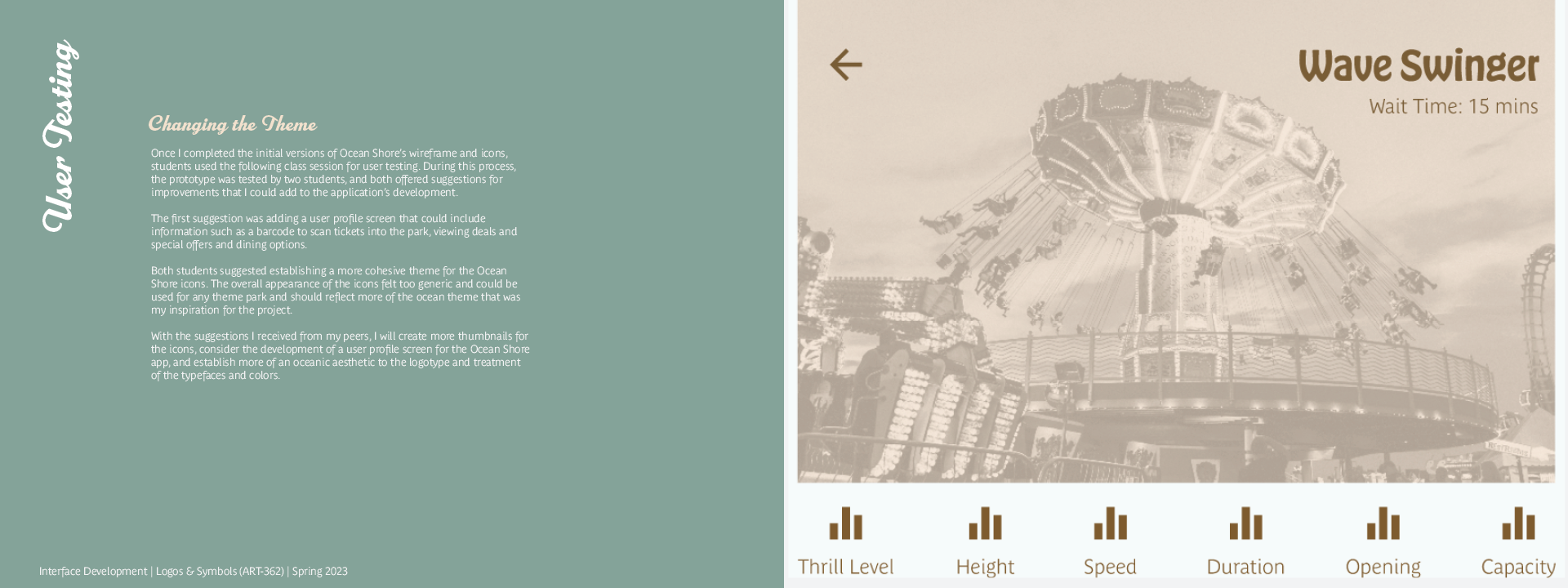
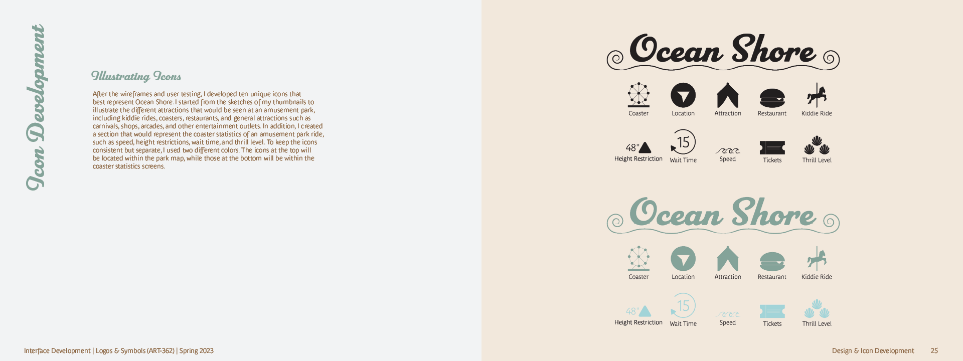
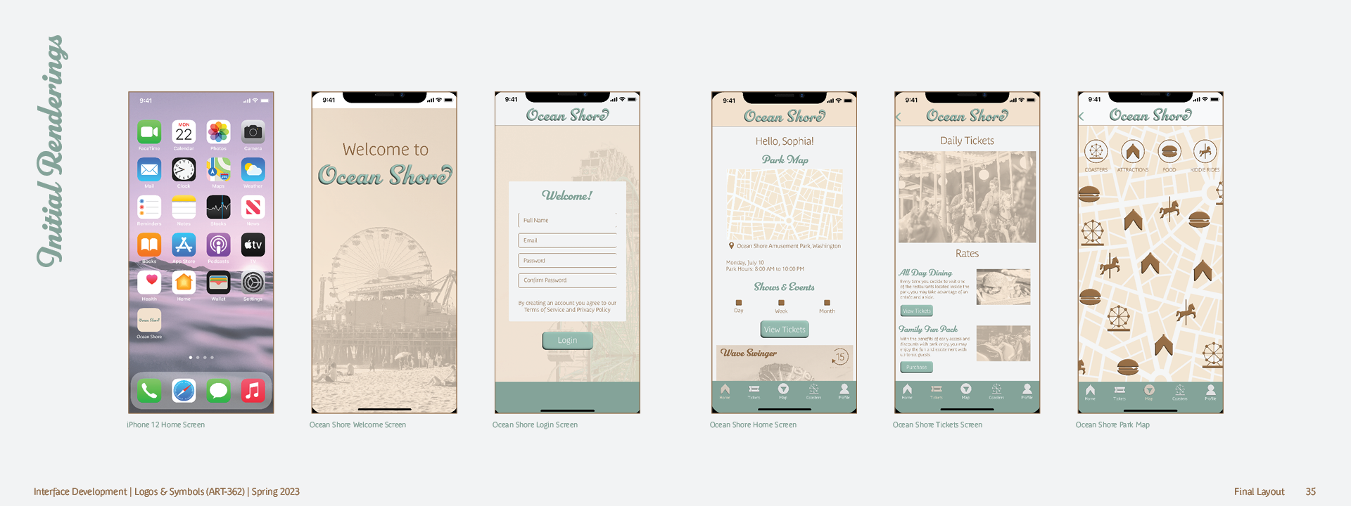
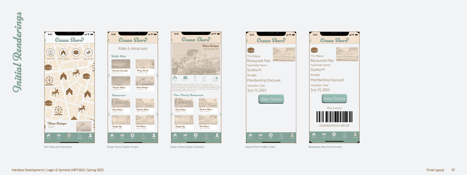
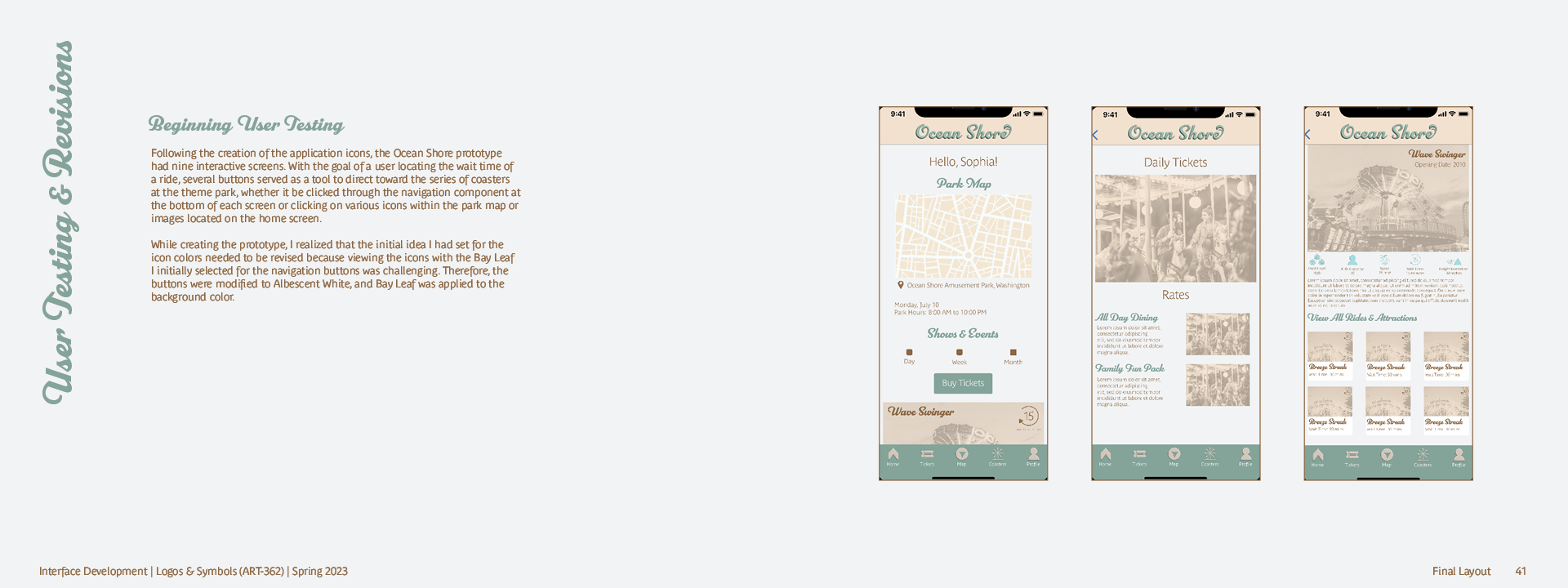
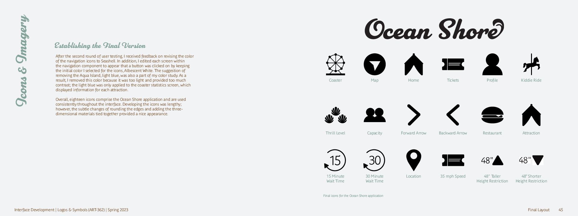
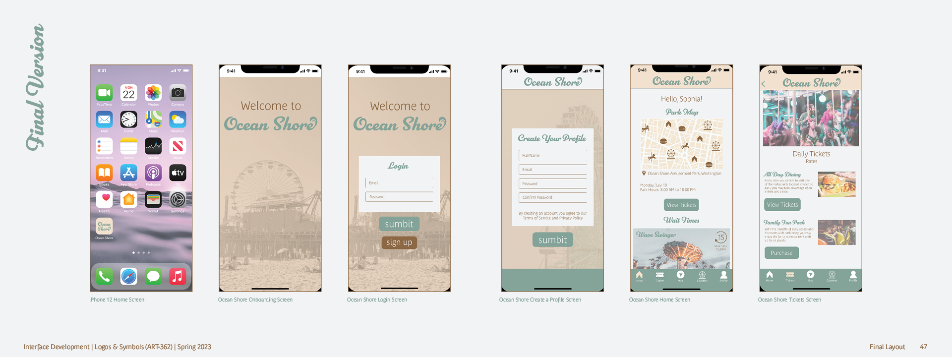
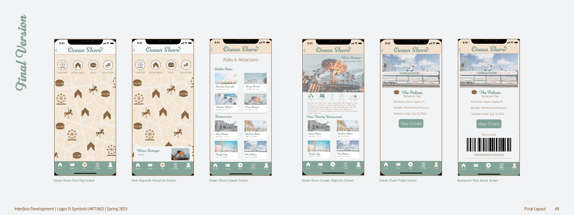
Twelve interactive screens make up the Ocean Shore interface, designed to provide a delightful user experience and real-time data, showcasing features such as coaster wait times and restaurant ticket purchases, and a set of icons aids navigation and interaction.


— Color & Type Studies

Process
— Sketches

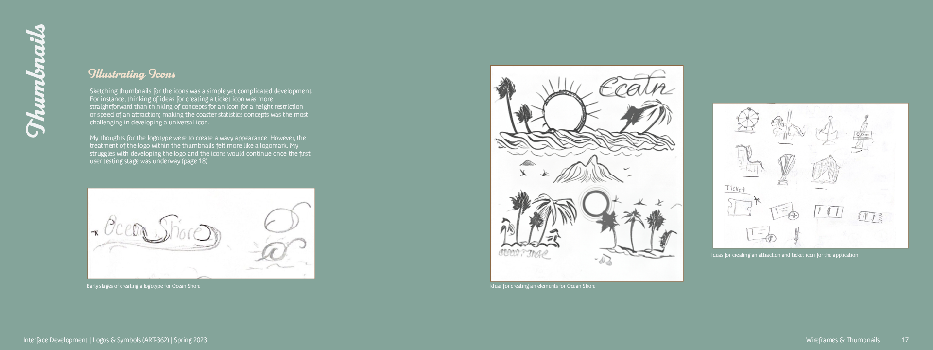
— Icon Development
— Early Wireframe Development


