Branding | Illustration | Kiosk | Process Book | Signage | UXUI | Website
Ritter Library
Wayfinding
CASA Blue
Pantone: 2139 C
CMYK: 57, 36, 14, 29
RGB: 90, 112, 140
HEX: #59708c
BW Orange
Pantone: 166
CMYK: 0, 70, 100, 0
RGB: 242, 99, 34
HEX: #f16321
BW Russet
Pantone: 463
CMYK: 13, 54, 88, 33
RGB: 122, 74, 24
HEX: #7a4a18
BW Green
Pantone: 5767
CMYK: 33, 18, 75, 25
RGB: 141, 146, 79
HEX: #8d924f
BW Brown
Pantone: 476
CMYK: 57, 80, 100, 45
RGB: 61, 45, 31
HEX: #3d2d1f
BW Gold
Pantone: 7406
CMYK: 0, 18, 100, 0
RGB: 255, 206, 52
HEX: #ffcc33
CASA Red
Pantone: 2035
CMYK: 0, 99, 99, 20
RGB: 204, 2, 2
HEX: #cc0202
CASA Gray
Pantone: 404 C
CMYK: 55, 49, 53, 18
RGB: 113, 109, 103
HEX: #716d67
Project Statement
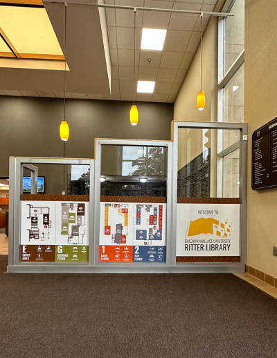
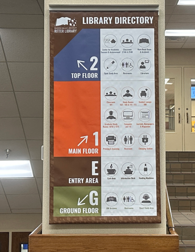
The Baldwin Wallace University Ritter Library Wayfinding system enhances the library’s navigation through an IRB-approved research process and strategic implementation. The project addresses challenges such as floor naming and visual consistency. A complete wayfinding strategy features distinct colors from the Center for Academic Success and Achievement (CASA) and the University’s brand kit for each floor—orange for the main, blue for the top, green for the ground, and brown for the entry area.
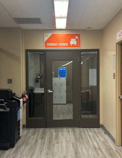
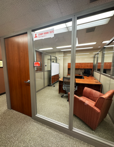
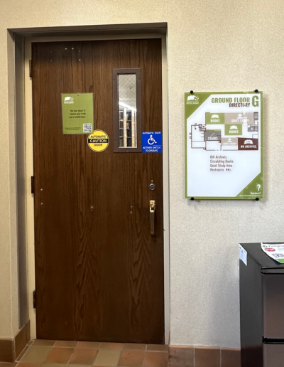
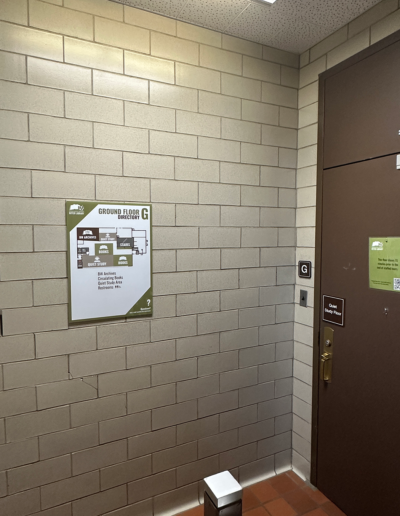
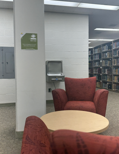
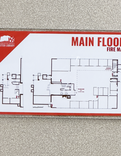
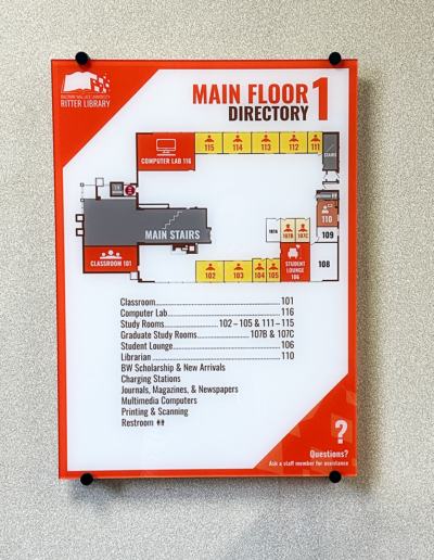
Redevelopment of fire maps, directories, and room identity signage such as the student lounge, quiet study, classrooms, study rooms, and tutoring spaces boost identification and navigation by creating over two dozen custom icons, preventing cognitive overload within Adobe Illustrator.
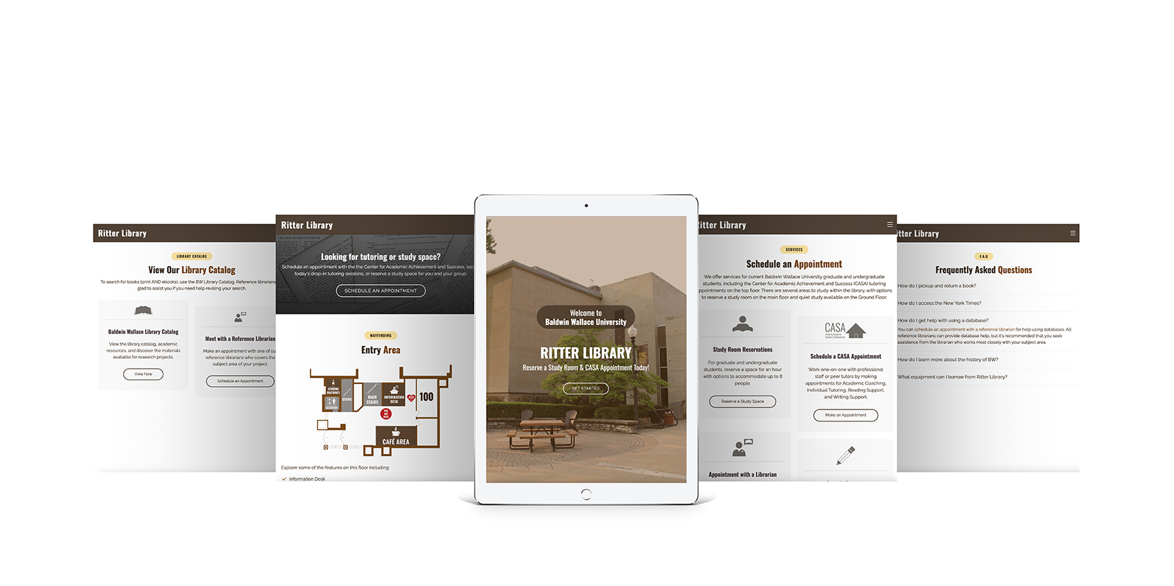
Alongside the signage, the development of a kiosk further implements wayfinding, allowing users to schedule a tutoring session appointment, book a study room, meet with a librarian, view the library catalog of print and ebooks, and locate spaces within the library. Utilizing Bootstrap, a website documents the library’s progression from IRB Testing to final installations.
User testing throughout the project sparks ideas and changes to improve the wayfinding of each floor. A series of signage mockups and eye-tracking glasses are utilized to see if the color coding, custom icons, sizing, and signage placement within the space are practical before final versions are approved and installed by University Relations.
Development
IRB Testing
One researcher will stay with the participant and ask the questions. The other researchers will observe the study a few feet behind on the computer. The researcher will ask participants to complete a few typical questions using Ritter Library’s physical space. Scripts for the specific tasks have been developed by the BW staff and faculty advisor for previous studies.
Procedure:
-
- Two researchers
- Participant asked questions to complete the task
Process:
-
- Welcome participant and explain the testing session
- The participant signs a consent form and completes a demographic survey
- Researcher calibrates eye-tracking software
- The researcher asks questions and takes notes as the participant completes tasks within the library
Task Questions:
-
- Where would you go to pickup a book?
- Locate the restroom.
- Suppose you had a tutoring appointment; where would you go to sign in?
IRB Testing with Eye Tracking Glasses: Locating Book Pickup
Pre-Study Takeaways
Researcher Notes:
-
- Establish distinct shapes and colors for each location to create a unique identity
- Assign a unique visual character to each region
- Utilize sightlines effectively for wayfinding
- Design simple, intuitive paths that are easy to navigate
- Incorporate landmarks for orientation
- Avoid overwhelming with excessive information
- Place signs strategically at decision points
- Offer wall maps and printed materials for user guidance
Participant Notes:
-
- Use the front desk, cafe area, and directory for better visibility (areas most participants check first)
- Consider using brighter colors for signage to attract more attention
- Place signs at decision points to guide participants effectively
- Consider incorporating a map to enhance navigation and provide clearer directions
Signage
Ritter Library Walkthrough:
-
- Identify critical decision points
- Discuss signage substrates and sizing for implementation
- Address inconsistencies in floor names and introduce cola or-coded system for each floor
- Collaborate with existing and developing signage to ensure seamless integration
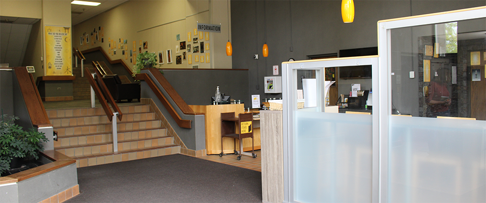
The main entrance to Ritter Library
May 2023
Working with University Branding:
-
- Adhered to existing University Brand Guidelines for signage decisions
- Made choices on color coding and font selections in alignment with the established brand guidelines
- Ensured the signage design conformed to the university’s visual identity standards
- Prioritized consistency for a cohesive look on each floor:
- Top Floor: CASA Blue
- Main Floor: BW Orange
- Entry Area: BW Russet
- Ground Floor: BW Green
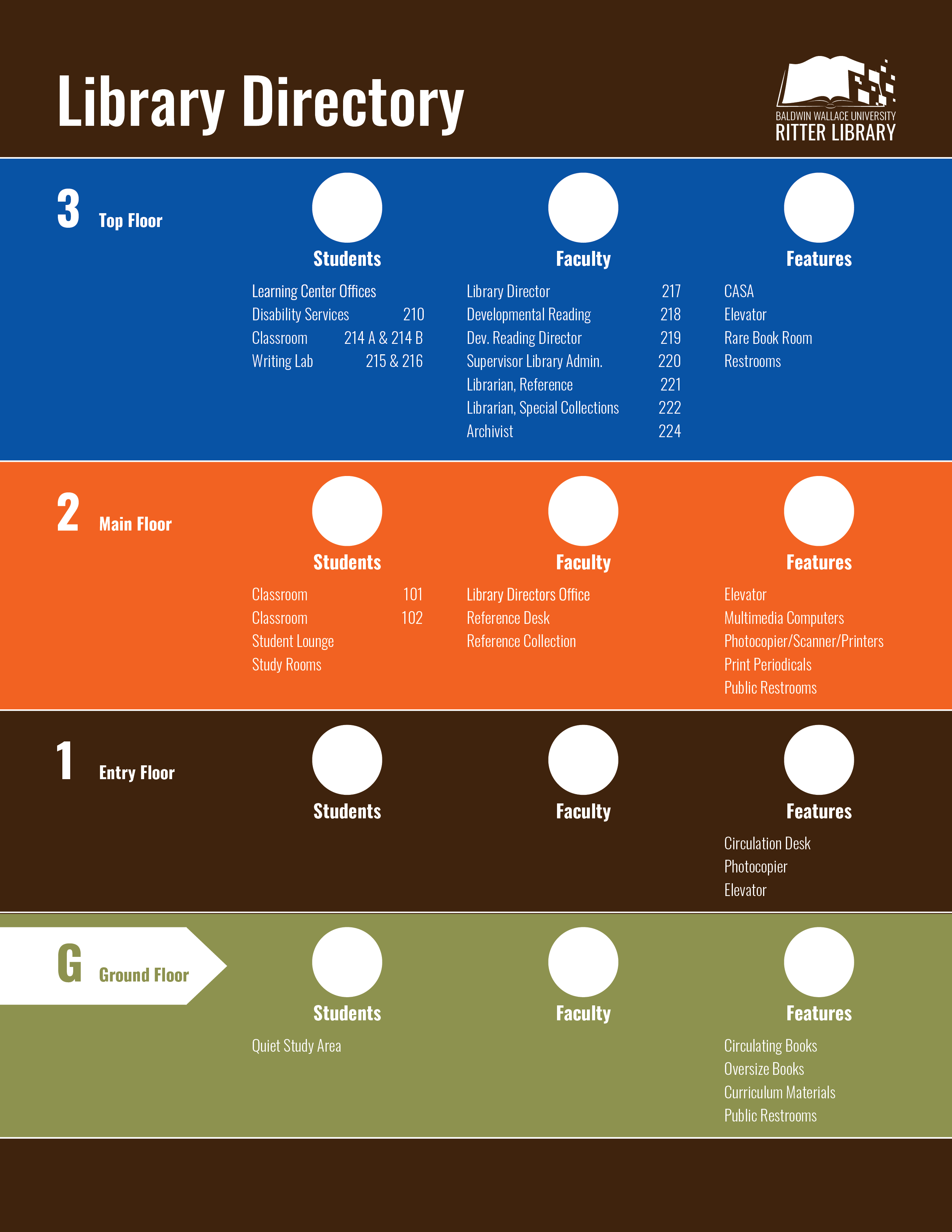
Initial Concept of Ritter Library’s
Main Directory Board
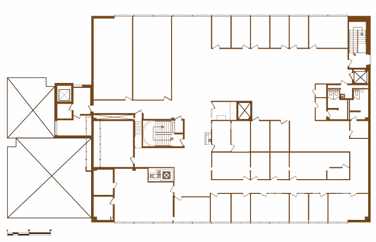
Early Development of Top Floor Map
Drawing New Floor Directories:
-
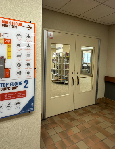
- Identified discrepancies in the current directory boards
- Recognized existing boards were outdated
- Worked to clarify new room numbers and configurations
- Addressed the need for up-to-date information on the directory boards
- Undertook corrective measures to ensure the boards reflected the current information
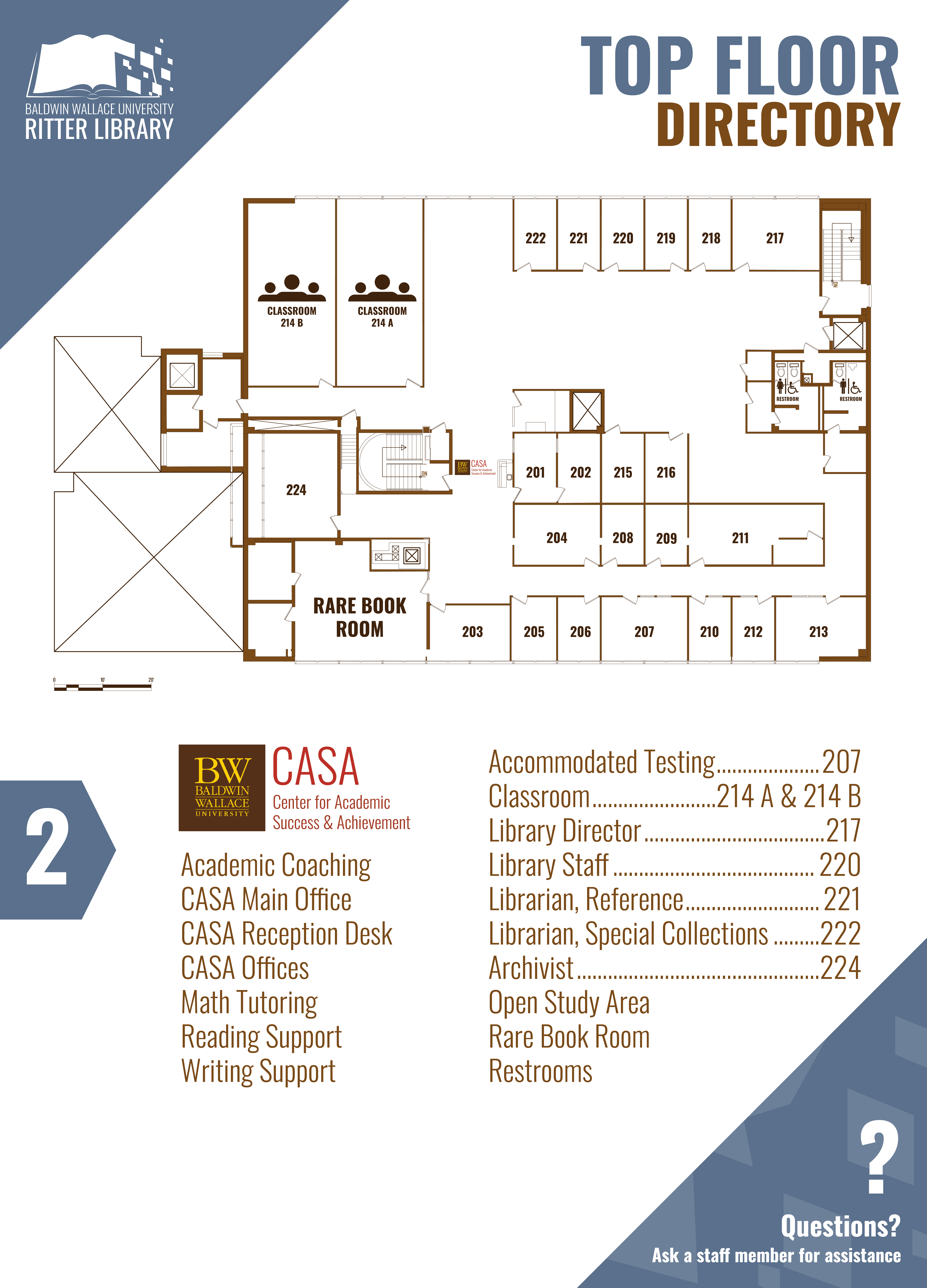
Process of Creating the Top Floor Directory
Icon Development:
-
- Addressed the wayfinding concerns by developing two dozen icons for quick understanding
- Intentionally designed icons to lighten cognitive load for users
- Focused on improving visual communication for easier comprehension
- Strived to create a more user-friendly experience by incorporating icons alongside text
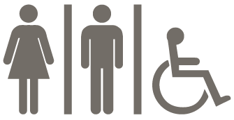
Accessible Restroom

Book

BW Archives

Cafe Area

CASA Logo

Charging Station

Classroom

Computer Lab

DVDs
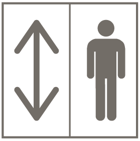
Elevator

Graduate Study Room

Information Desk

Librarian

Open Study Area

Periodicals

Printing & Scanning

Quiet Study Area
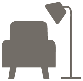
Student Lounge

Undergraduate Study Room

Vending Machines
Producing Mockups:
-
- Created initial designs that were tiled and printed on office printers
- Assembled the printed tiles by cutting and taping them together
- Facilitated a visual preview of the concepts in the spaces
- Conducted several revisions to assess the size, placement, and accuracy of information
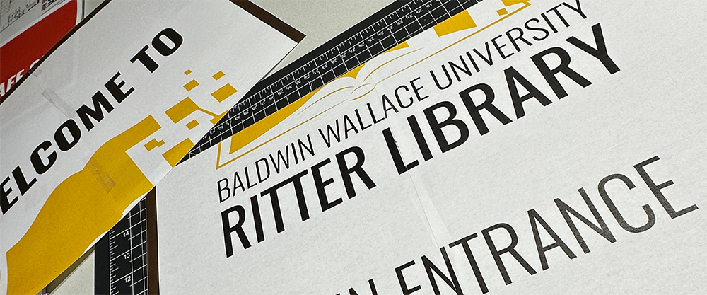
Cutting a Mockup for Entry Area Glass Panels
Enhancing Accessibility:
-
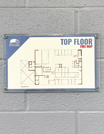
- Updated fire maps to reflect the current library layout
- Added locations of fire extinguishers and the AED to the updated maps
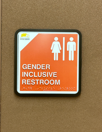
- Expanded the use of braille signs to mark permanent spaces
- Customized braille signs to align with Ritter Library’s wayfinding system
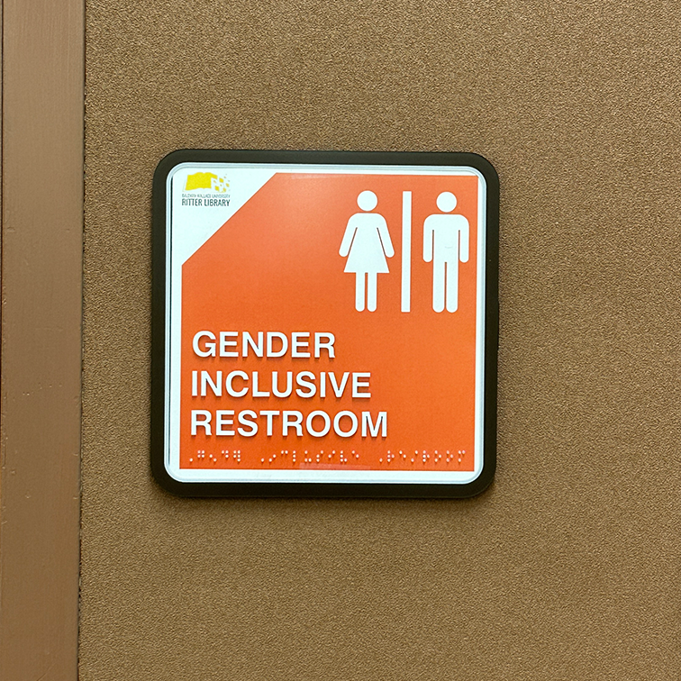
Main Floor Restroom Mockup
Kiosk
Gathering Resources:
-
- Study Room Reservations
- Scheduling a CASA appointment
- Appointment with a Librarian
- Drop-In Tutoring
- Baldwin Wallace University’s Library Catalog
- Frequently Asked Questions
Coding the Kiosk:
-
- CSS Styling
- .box class
- Background color, text alignments, border radius, position, and overflow behavior
- Button Hover Effects
- Correspond to links for appointments and reservations
- .box class
- JavaScript
- Navigation
- Prevents default link behavior when the dropdown menu is activated
- Changes hamburger icon appearance for the menu list and close button
- Navigation
- CSS Styling
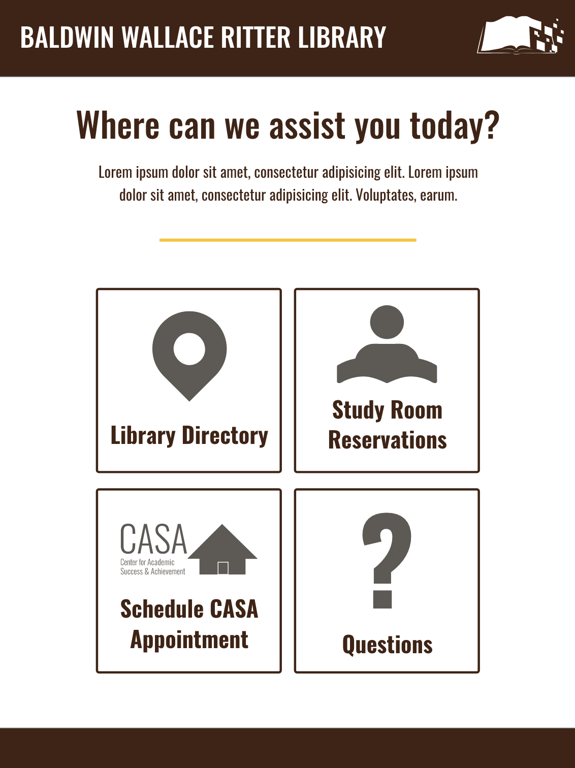
Preview of Ritter Library Wireframe
Ritter Library Kiosk Screens
Kiosk Features:
-
- Bootstrap v5.3
- Includes five interactive screens
- Six resources for visitors to register and schedule appointments
- Floor maps and corresponding directories
- FAQ section with a list of common questions from the Ritter staff
UXUI Testing
Testing the Kiosk:
-
- Collected user-testing with graphic design students
- Created several surveys
- Pre-study questions with a media consent form
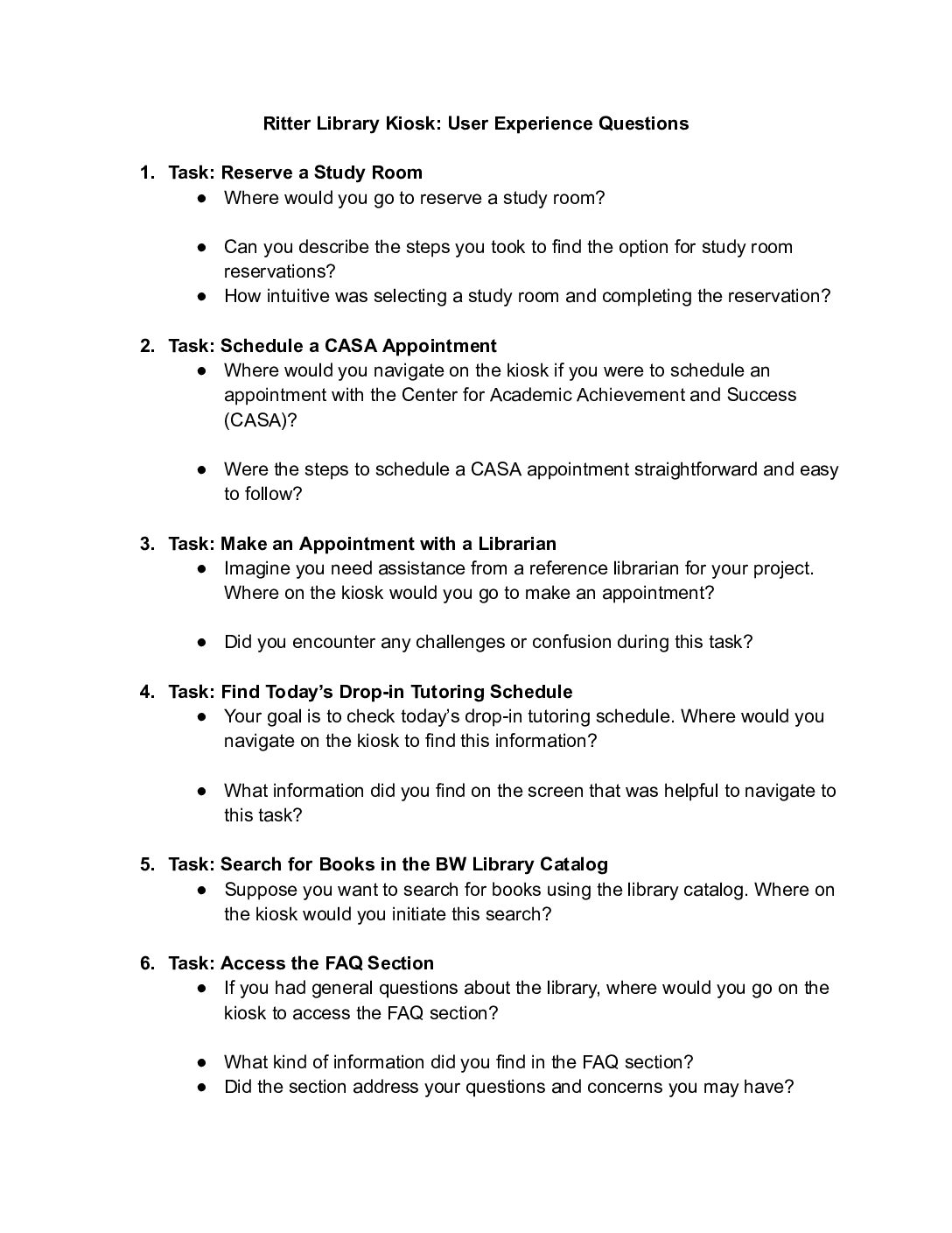
- User experience questions
- Post-study questions
- Collected data on user response time
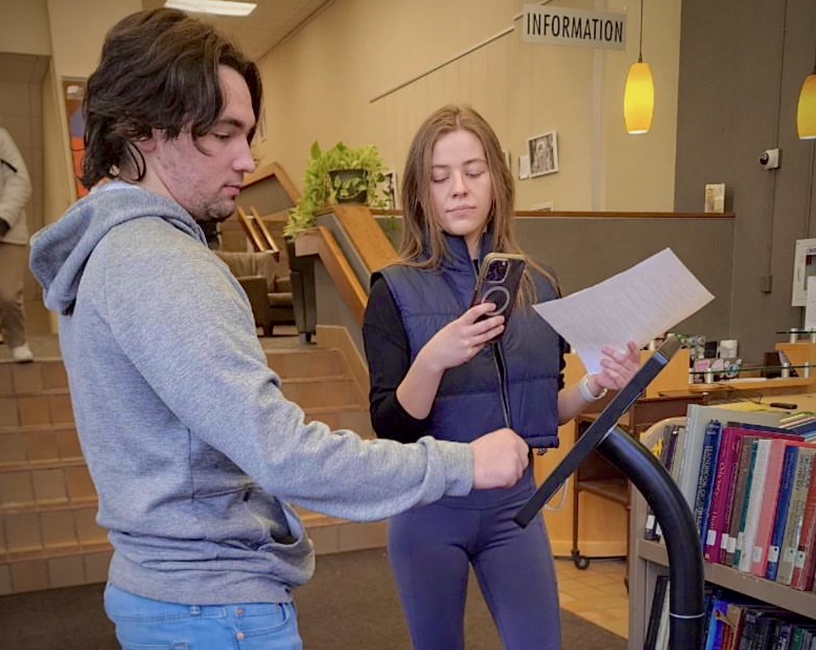
User-Testing Kiosk with Students
User Experience Test Questions:
-
- Ask the participant to go back to the home screen after completion of each task
- Recorded the amount of time to complete each task:
- Reserve a study rooms
- Schedule an appointment with CASA
- Make a librarian appointment
- Find today’s drop-in tutoring schedule
- Search for books in BW Library Catalog
- Access FAQ section
User Experience Questions
Website Development
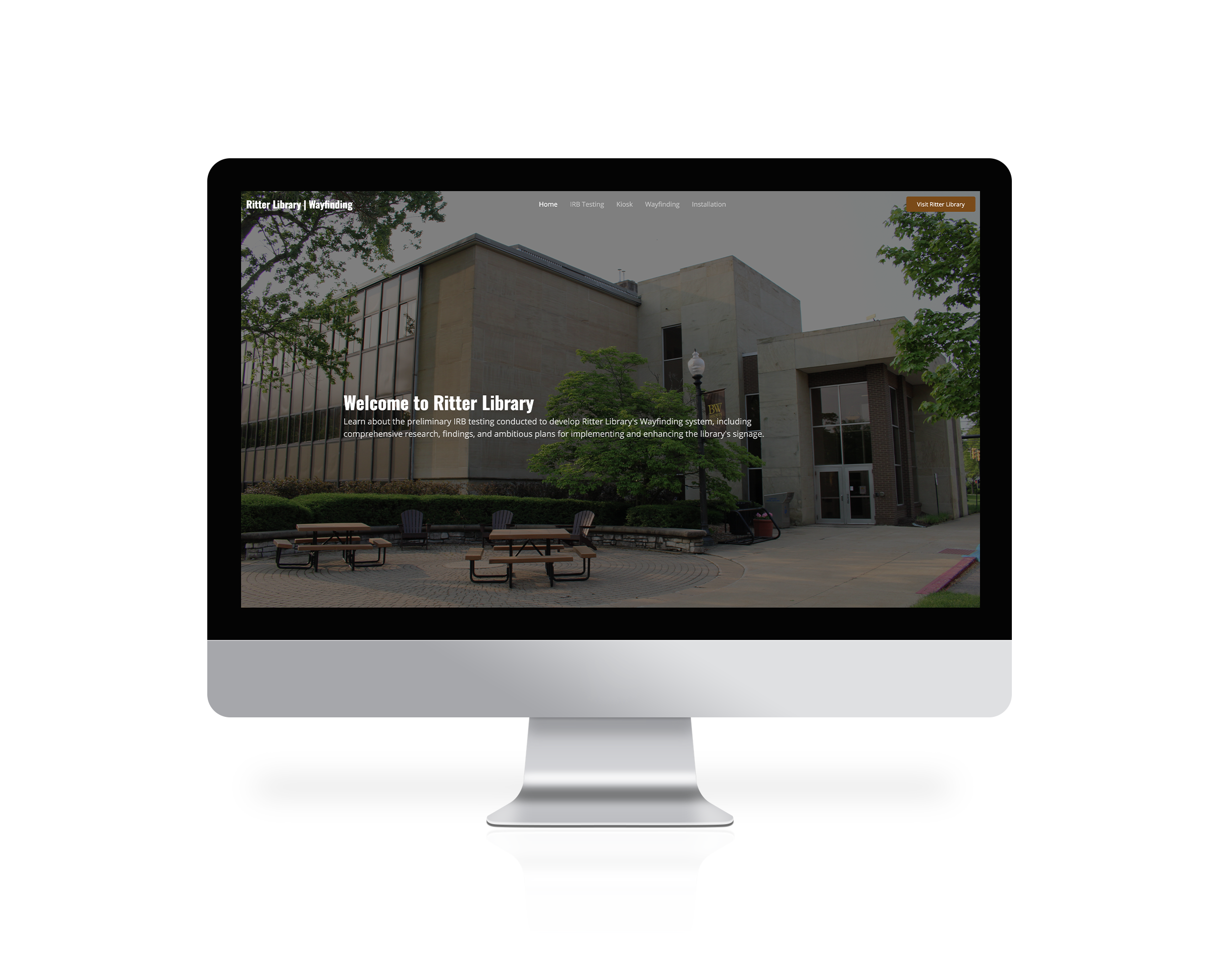
Ritter Library Home Page
Website Features:
-
- Bootstrap v5.3
- One page site
- Preliminary IRB testing conducted for Ritter Library’s wayfinding
- Comprehensive research and findings gathered from the research phase
- Plans outlined for implementing the library signage
- Data on improving user navigation within the library
Main Elements:
-
- Event Listeners & DOM Content
- Uses listeners to know when the webpage is fully loaded
- Toggle Scrool Top Button
- Picks the scroll-top button using document.querySelector
- Creates a function toggleScrollTop to show or hide the button based on scroll position
- Sticky Header
- Keeps track of the last scroll position with a variable
- Adjusts the header’s position during scrolling
- Image Gallery
- Displays installations in Ritter Library as a grid
- Filter options are presented in a list, allowing users. to categorize installations by floor
- Each installation item consists of an image, title, and a lightbox for an enlarged preview
- Event Listeners & DOM Content
INSTALLATIONS
Before & Afters:
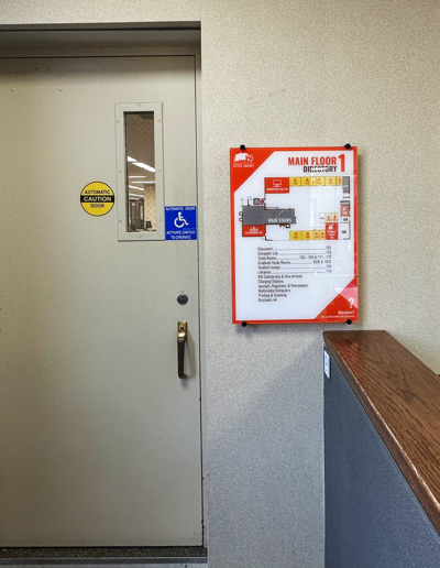
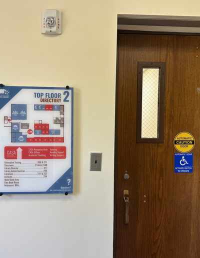
Here is a look at a few renovations to Ritter Library, including installing nine new directories and additional room signage, including the entry area glass panels.
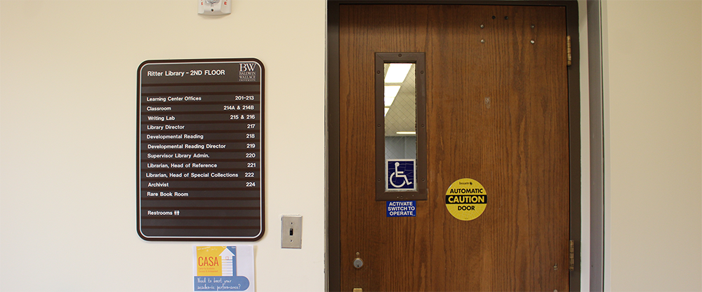
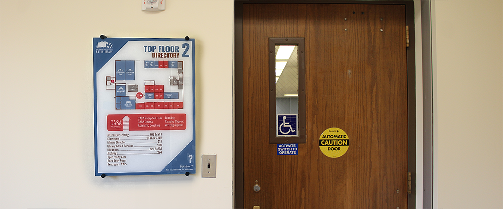
Top Floor Directories: Before & After
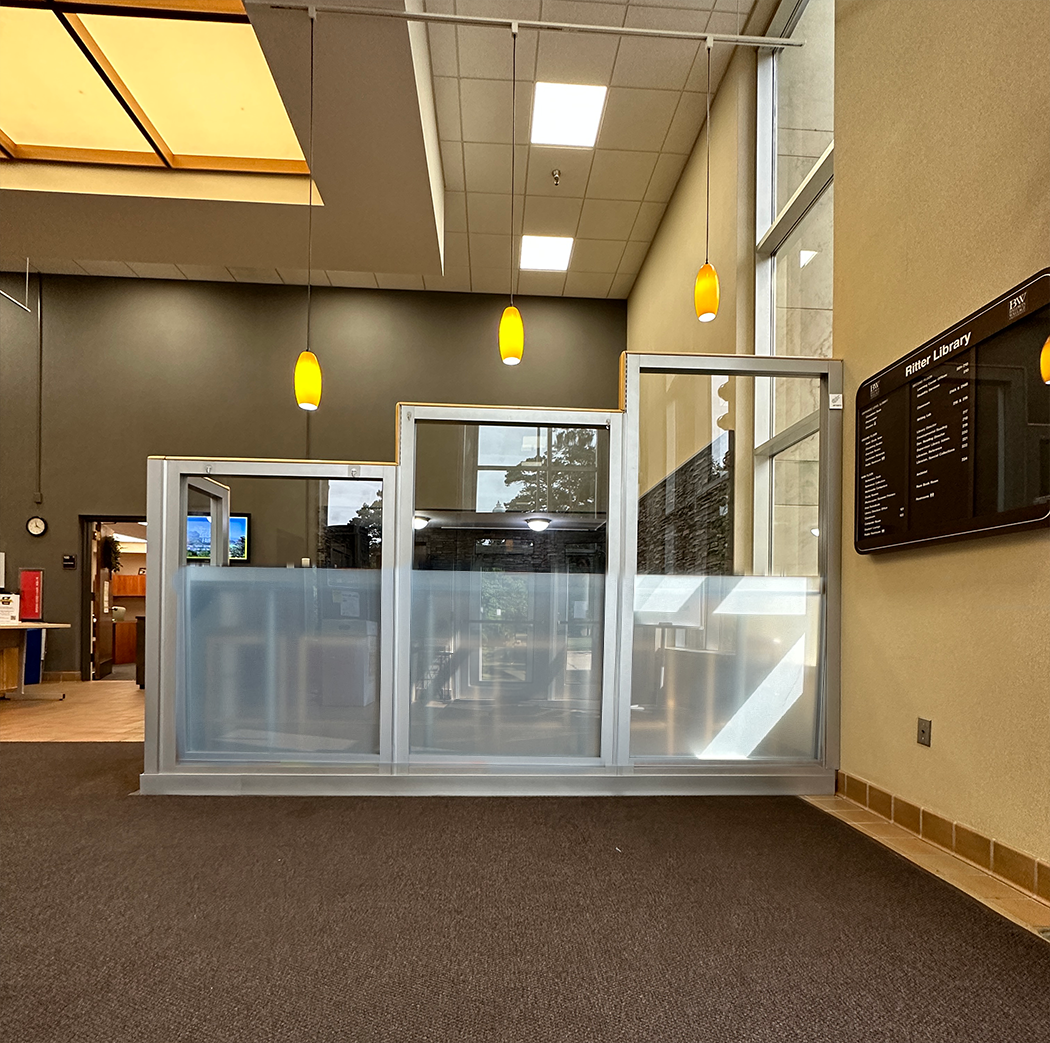
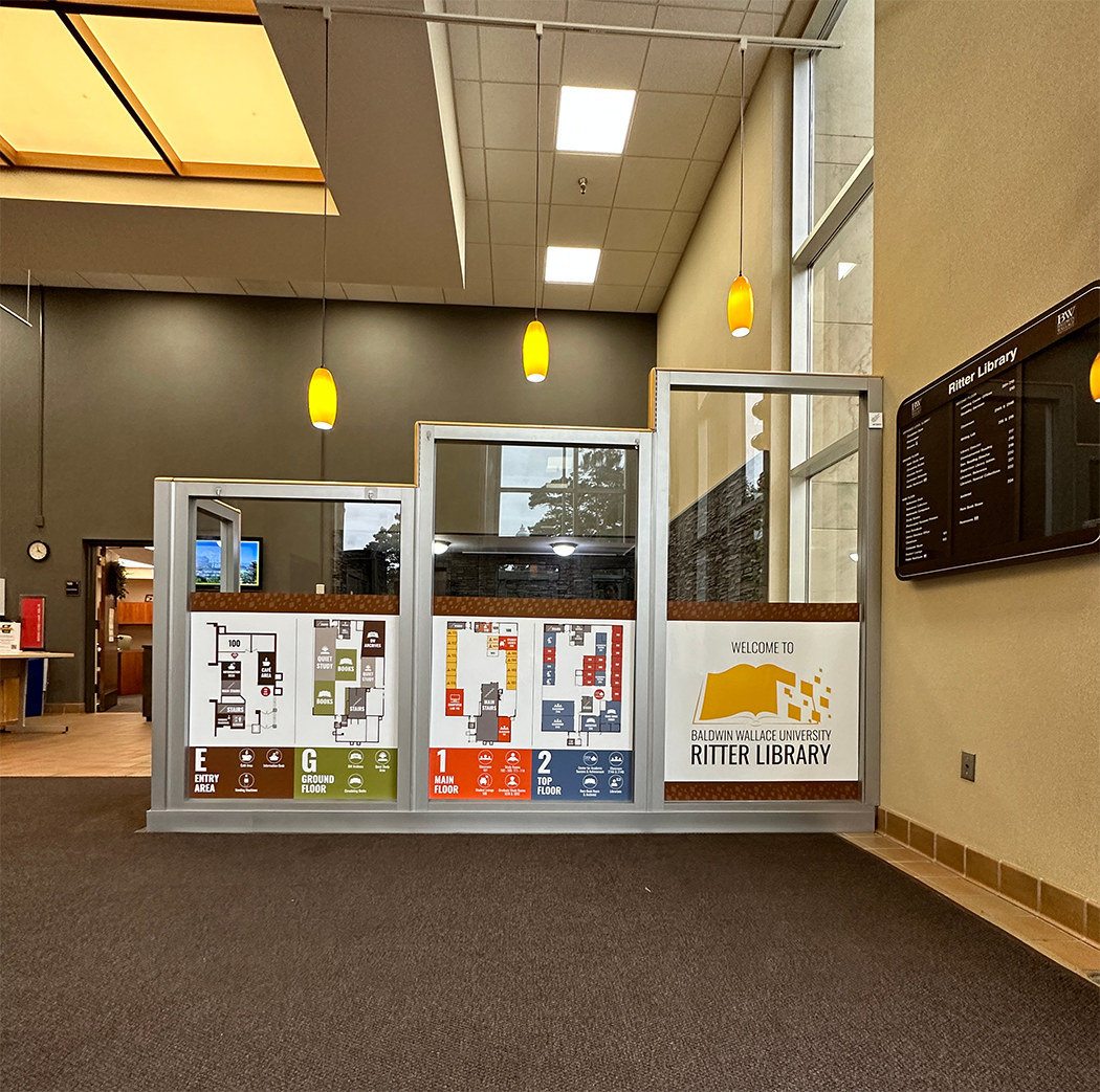
Entry Area Glass Panels: Before & After
New Kiosk
View the final installation of Ritter Library’s new addition of an interactive kiosk featuring floor maps, resources, and options for students to schedule appointments.
Ritter Library Kiosk
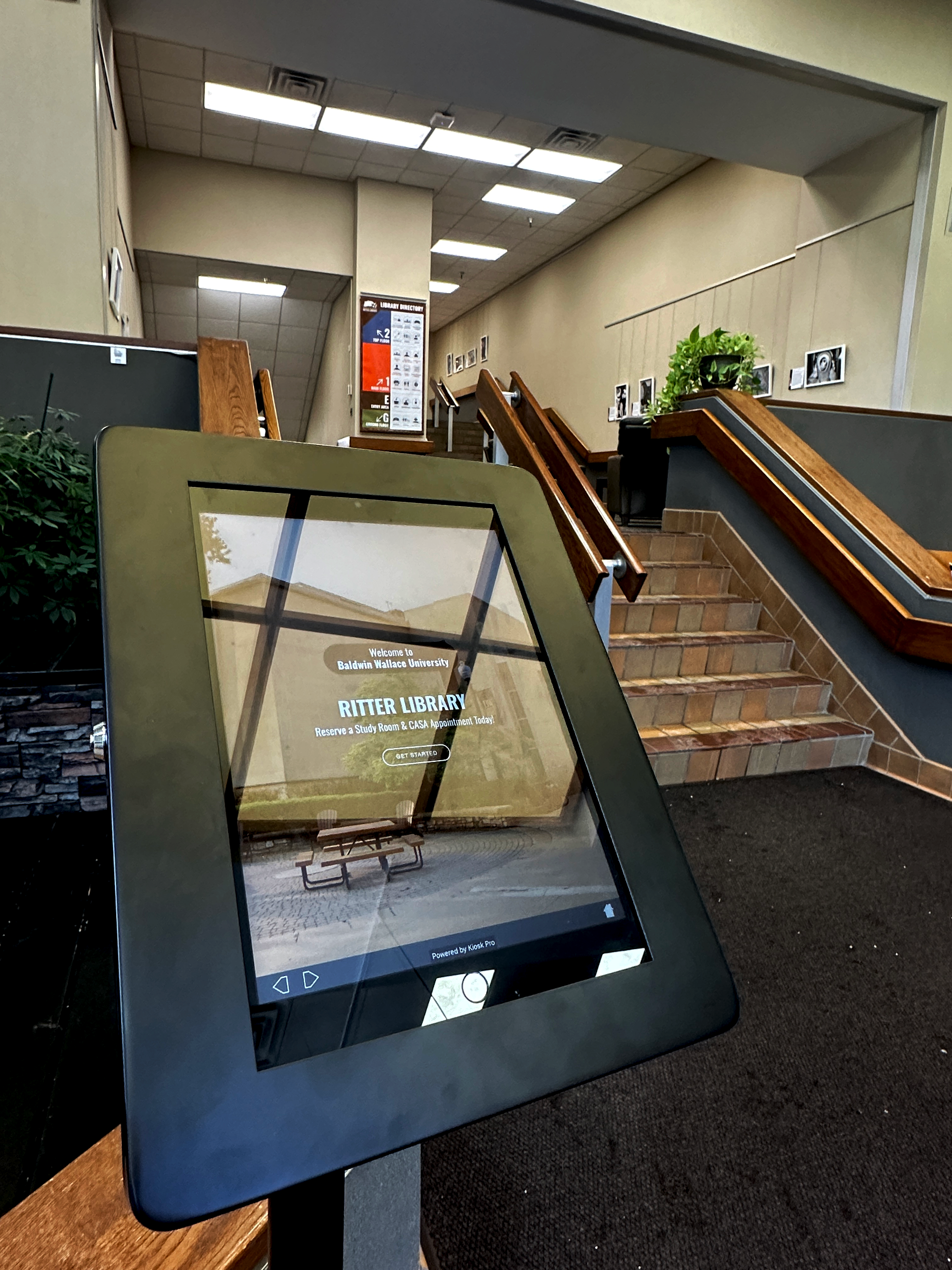
Kiosk Installed in Entry Area of Ritter Library
Bootstrap Website
Ritter Library Wayfinding
View the Entire Timeline Ritter Library’s Wayfinding

